How to Create XYPlot?
The XYPlot panel is available in the left span of VCollab Pro. Users can create, export and import XY data and graphs. XYPlot can be accessed through the Edit Menu, or through the shortcut in the toolbar.
Note:
XYPlot is applicable only for Nodal Results. Elemental results will not be displayed in the viewer.
In case of a transient plot, a maximum of first 500 node IDs or curves are considered for plotting. Remaining IDs are ignored.
XYPlot Types
IDs Path
Transient
Min Max
Force Deflection
Harmonic
XYPlots are classified into Editable and Non-Editable. Imported and Merged Plots are always non-editable.
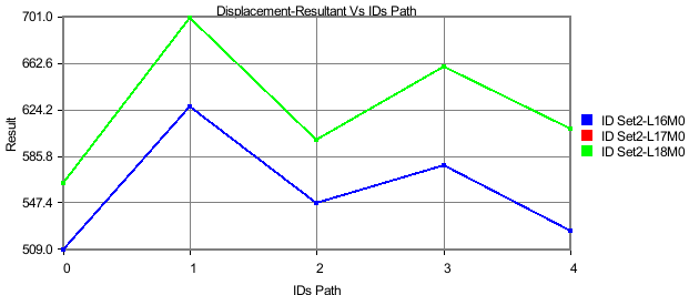
IDs Path Plot
In this plot,
X axis : IDs Path or CAE Result
Y axis: CAE Result
Inputs : ID sets, Instances. A Node ID set or path is a sequential list of IDs.
Users can define multiple paths or ID sets. One curve corresponds to one ID set per instance.
They can fix the instance and vary the ID path to understand how each path varies against the sequence. Similarly, users can keep the ID path fixed and vary the selection of instances to understand how the sequential path varies between instances on time steps. Users also have the option to vary both ID path and selection of instances.
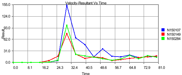
Transient Plot
In this plot,
X axis: Time/Frequency/Instance Number/ CAE Result.
Y axis: CAE Result.
Input: Node ID sets. Instances.
Each curve refers to a nodal ID and how its CAE result varies over time or frequency or instances.
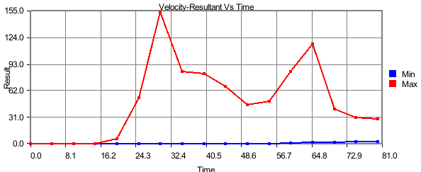
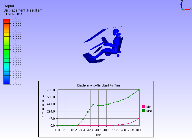
Min Max Plot
In this plot,
X axis: Time/Frequency/Instance Number/ CAE Result.
Y axis: CAE Result.
Input: Instances.
Min curve refers to the minimum of CAE results over the instances.
Max curve refers to the maximum of CAE results over the instances.
Note:
Minimum and maximum values are computed from the results of visible parts.
So the min/max curves will vary according to visible parts.
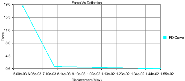
Force Deflection Plot
In this plot,
X axis: Maximum of displacement result.
Y axis: Sum of reaction forces.
Input: Node ID sets, Instances.
A force deflection plot represents one Node ID set, sum of forces of Node ID set list and how it varies over the maximum displacement of Node ID set over instances. This type of plot will be listed only if the CAE model contains Displacement and Reaction Force results.
This is a special case of transient plot. A set of IDs are considered as input to this plot. For each instance or time step, Reaction Force / Force Loads and Displacement values of these IDs are considered. The maximum displacement values for all instances provide the range for the X axis. Sum of Reaction Force values is considered for the Y axis. This plot contains a single curve.
For example, let the number of instances be 4. Let the ID’s selected be { ID1, ID2, ID3}. The following table provides Reaction Force and Displacement values of these IDs over the instances.
Time Step
|
Reaction Force/ Force Loads |
Displacement |
||||||
ID1 |
ID2 |
ID3 |
Sum(ID1+ID2+ID3) |
ID1 |
ID2 |
ID3 |
Max(ID1,ID2,ID3) |
|
T1 |
U11 |
U12 |
U13 |
F1 |
V11 |
V12 |
V13 |
D1 |
T2 |
U21 |
U22 |
U23 |
F2 |
V21 |
V22 |
V23 |
D2 |
T3 |
U31 |
U32 |
U33 |
F3 |
V31 |
V32 |
V33 |
D3 |
T4 |
U41 |
U42 |
U43 |
F4 |
V41 |
V42 |
V43 |
D4 |
X Axis Range = Min/Max (D1,D2,D3,D4);
Y Axis Range = Min/Max (F1,F2,F3,F4);
In other words, the data points of the curve are as follows,
{ (D1,F1), (D2,F2), (D3,F3), (D4,F4) }.
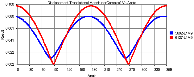
Harmonic Plot
In this plot,
X axis: Angle (0 to 360)
Y axis: Complex Derived Result
Input: Node ID sets, Instances.
This plot is applicable only for complex Eigen results. Harmonic plot displays the variation of any complex results with respect to angle (= ωt). Using this plot, users can identify the angle for which a derived result is maximum.
Note:
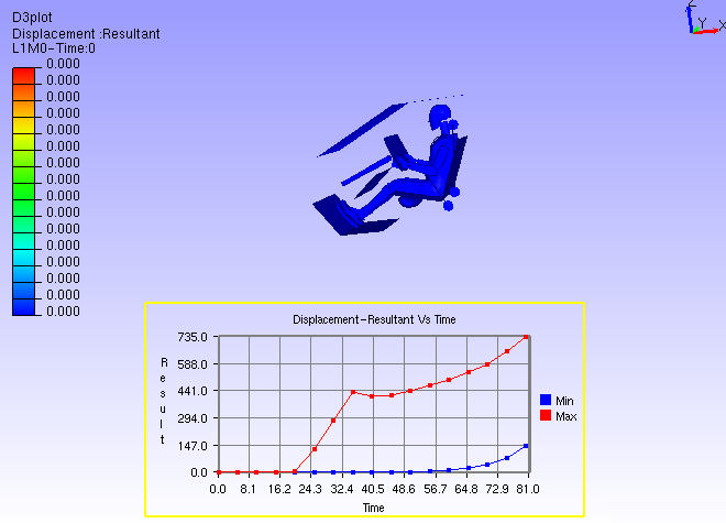
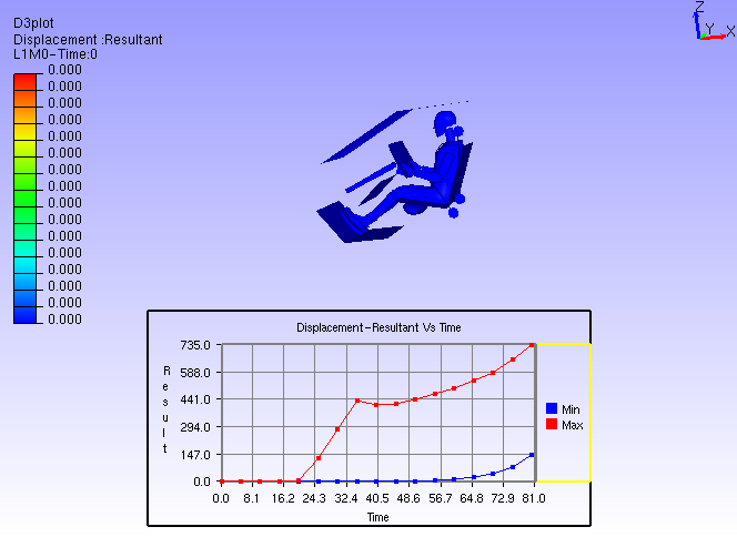
A vertical timeline (datum) is updated and displayed during CAE transient animation in Transient and Min Max plots.
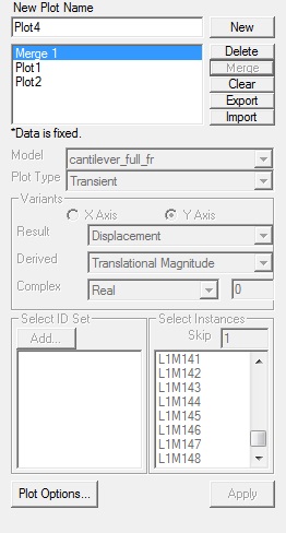
How to create an XYPlot
Open XYPlot from the left span or click Edit | XYPlot
Enter the XYPlot name in the text box.
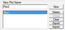
Click New.
Make sure that an empty XYPlot is displayed in the viewer and plot name is appended in the list box.
Select a CAE model from the Model drop down list.
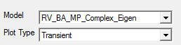
Select the plot type you wish to build.
Select the variants for X and Y axes. An X variant may be a CAE result or result attribute
Y variant should be of CAE result.
If the result is complex, please select complex component Real, Imaginary, Magnitude,
Phase and Angle.
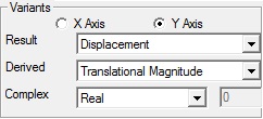
Select the appropriate derived scalar for both axes.
Click Add to define the ID sets.
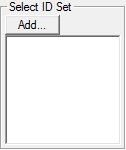
It opens up the ID Set dialog box.
Users have the following options to provide Node ID set.
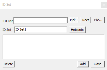
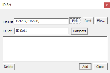
Enter the known Node IDs in the text box separated by commas,
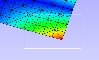
Pick the Node IDs in the viewer,
Provide a file which contains Node IDs
Use Rect for window selection on the model
Get CAE probed or hotspot labels.
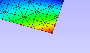
12. To pick the Node ID from the viewer, enable the Pick push button.
13. Click Nodes in the viewer. Node ID points are highlighted with red color. Node IDs are
Appended to the text box in the dialog for each click.
All points are connected by a line to show the sequence or path.
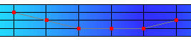
To select by window, click Rect which enables mouse mode for window selection. Click and drag to define the window on the model using the left mouse button.
All node IDs within the window are highlighted as red spots.
Click Hotspots to bring all IDs for probed or hotspot labels that exist
Enter an ID set name.
Click Add to create the ID set
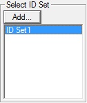
The newly created ID set is listed in the XYPlot panel.
Select the ID sets required for your plot. ID set selection is not required for Min Max XYPlot.
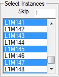
Select the Instances required for the plot. If the instance list is too large for selection, users can filter using the Skip option.
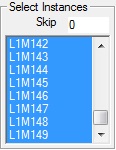
Skip option skips every nth instance between every consecutive selection. Where n is the number entered by the user in the Skip text.
Click Apply to construct the XY Plot with the above information and display it in the viewer.
How to modify the XYPlot style
Create a plot and construct with CAE data
XYPlot can be modified with text formats
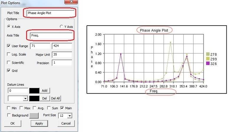
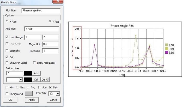
Click Plot Options in the XYPlot panel Or Use “Ctrl + Double Click” to open up XYPlot Options dialog box.
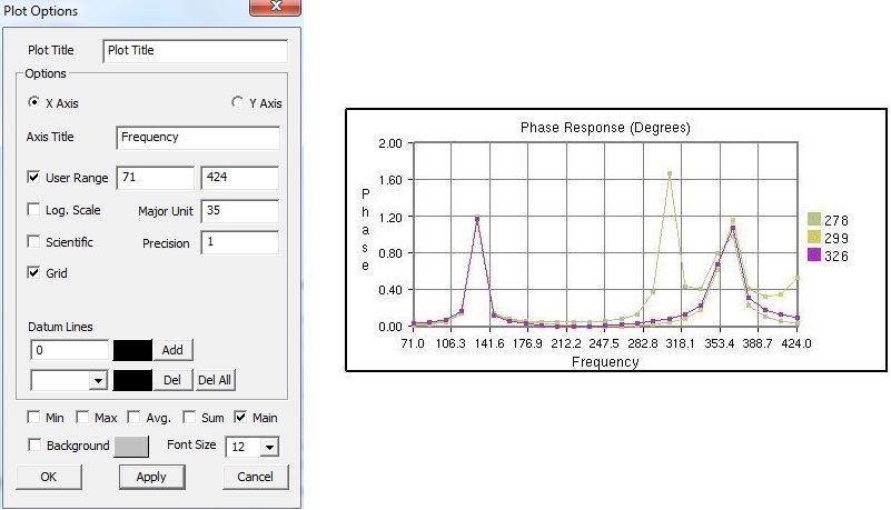
Change the plot titles.

Change Y axis user range, major unit and precision values.
Change X Axis range, major unit and precision values.
Grids for each axis can be switched on/off.
Click Sum, Max, Min and Average options and uncheck main.
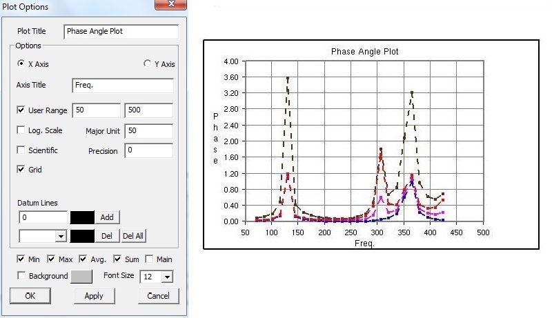
All these special curves can be seen in stippled lines. Sum curve will be seen in dark brown, Max curve in Red, Min Curve in blue and Average curve in magenta.
If there is a large variation between curves then log. scale can be used for corresponding axis.
Scientific format can be used when tick mark texts are lengthy.
Enable Background to set background color.
How to select, move and resize the plot
Click a plot name in the plot list of XYPlot panel Or Double click the plot in the viewer
The XYPlot will be highlighted and ready for moving resizing.
Move mouse cursor over plot. Mouse cursor will change to
 .
Drag the mouse to move the plot.
.
Drag the mouse to move the plot.Move the mouse to the plot edges and notice that mouse cursor symbol is changing to
 Click and drag the mouse with the resize
symbol to resize the plot.
Click and drag the mouse with the resize
symbol to resize the plot.Double click to select plot regions.
Selected region can be resized.
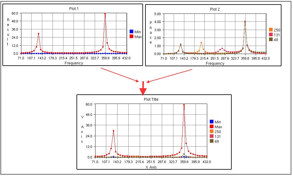
How to merge plots
Select XYPlots in the plot list panel.
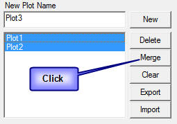
Click Merge.
A new Non-Editable plot is created and appended in the list. All dialog controls will be disabled for the non-editable merged plot.
The same plot is displayed and highlighted in the viewer.
How to export and import XYPlot data
Select XYPlots from the plot list.
Click Export which opens up file-save dialog.
Enter a filename.
Plot name is suffixed to the file name. Each plot is exported as one csv file.
To load existing plot files,
Click Import which opens the file browser dialog with file type .csv by default. VCollab supports csv files and LSDyna binout data files.
The CSV file should be in a particular format as explained later in this module.
Select all the XYPlot CSV files and click open.
All plots are imported as Non-Editable plots as it does not contain CAE information.
Change the File type in the file browser dialog as binout to import LSDyna binout data.
Steps to edit XYPlot curve color
Select the XYPlot.
Double click on the Plot Legend rectangle to highlight it.
Click on the color palette box to open the color dialog box.
Select a color and click OK.
XYPlot Data File Format
This is a comma separated value (CSV) file and contains only values and header descriptions with a single x axis in the variant column.
Line 1 |
File Type Header |
VCOLLAB_XYPLOT_FILE_CSV_X_SINGLE |
Line 2 |
Column Headers |
<X axis Invariant>,<Curve1 Name>,<Curve 2 Name>, …, |
Line 3 |
Value 1 |
<val>,<val>,<val>,…, |
Line 3 |
Value 2 |
<val>,<val>,<val>,…, |
Line … |
Value .. |
<val>,<val>,<val>,…, |
Line N |
Value N |
<val>,<val>,<val>,…, |
<EOF> |
Example:
VCOLLAB_XYPLOT_FILE_CSV_X_SINGLE Time,Node1, Node2, Node3, 0.0, 0.0, 0.5, 0.023, 0.1, 2.0, 0.35,1.023, 0.25,3.0,0.023,2.653, 0.302, 4.0,0.02,2.023, 0.43,13.0,0.5,1.023, 0.5,17.0,1.5, 2.023, |