XYPlot
The XYPlot feature allows users to create, export and import XY data and graphs. The XYPlot panel is available in the left span of the viewer window along with Product Explorer. User can access XYPlot Explorer panel from:
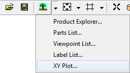
Toolbar
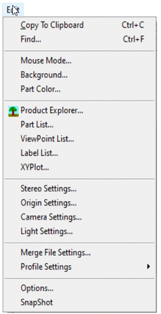
Left Span of the Presenter window.
.
XYPlot Types : There are different types of XYplots supported in VCollab Presenter
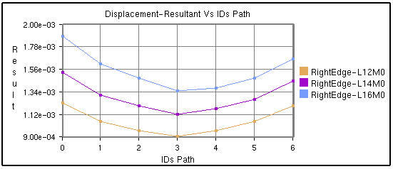
IDs Path
Transient
Min Max
Force Deflection
Harmonic
In general, XYPlots are classified into Editable and Non-Editable. Imported and Merged Plots are always Non-editable.
Note: XYPlot is applicable only for Nodal Results. Elemental results will not be displayed in the Presenter.
In case of transient plot, a maximum of first 500 node IDs or curves are considered for plotting.
Quick links
XYPlot Panel
How to create and build XYPlot?
XYPlot Options Panel
How to add Datum lines?
How to change XYPlot style?
How to select, move and resize XYPlot?
How to merge XYPlots?
How to export and import XYPlots?
How to edit XYPlot curve color?
XYPlot Data File Format
User Interface for Binout data
How to import LSDyna binout data into XYPlot?
How to import History Plot Data files?
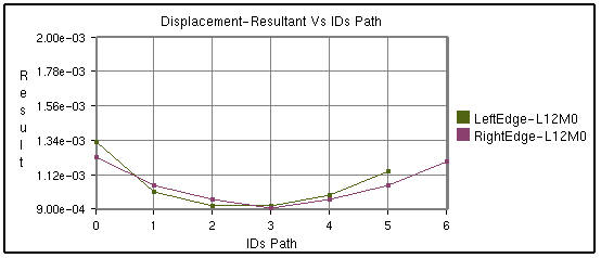
Path Plot
X axis : IDs Path or CAE Result
Y axis: CAE Result
Inputs : Node ID sets, Instances. A Node ID set or path is a sequential list of IDs.
Users can define multiple paths or Node ID sets. One curve refers to one Node ID set per instance.
Users can fix the instance and vary the value of Node ID sets to understand how each path varies against the sequence.Alternately, users can fix the Node ID set and vary the instance to understand how the same sequential path varies between instances or time steps. Users can also vary both the Node ID sets and instances.
Same Instance with different Node ID sets
Same Node ID set but different instances
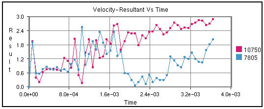
Transient Plot
X axis: Time/Frequency/Instance Number/ CAE Result.
Y axis: CAE Result.
Input: Node ID sets. Instances.
Each curve refers to a nodal ID and how its CAE result varies over time or frequency or instances.
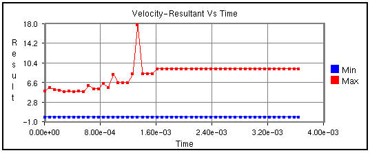
Min Max Plot
X axis: Time/Frequency/Instance Number/ CAE Result.
Y axis: CAE Result.
Input: Instances.
Min curve refers to the minimum of CAE result over the instances.
Max curve refers to the maximum of CAE result over the instances.
Note:
Minimum and maximum values are computed from the results of visible parts.
So the min/max curves will vary according to visible parts.
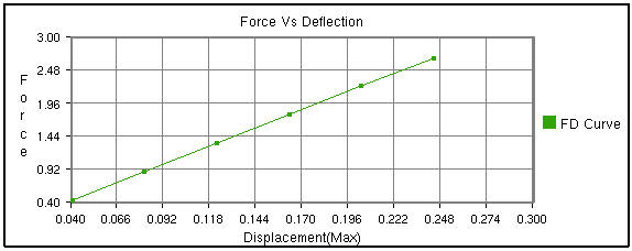
Force Deflection Plot
X axis: Maximum of displacement result.
Y axis: Sum of reaction forces.
Input: Node ID sets, Instances.
A curve refers to one Node ID set, sum of forces of Node ID set list and how it varies over the maximum displacement of Node ID set among over instances. This type will be listed only if the CAE model contains Displacement and Reaction Force results.
This is a special case of transient plot. A set of IDs are considered as input to this plot. For each instance or time step, Reaction Force / Force Loads and Displacement values of these IDs are considered. These maximum displacement values for all instances provide the range for X axis. Sum of Reaction Force values is considered for the Y axis. This plot contains a single curve.
For example,
Let the number of instances be ‘4’.Let the ID’s selected be { ID1, ID2, ID3}.The following table provides Reaction Force and Displacement values of these IDs over the instances.
Time Step / Instances
Reaction Force/ Force Loads
Displacement
ID1
ID2
ID3
Sum
(ID1+ID2+ID3)
ID1
ID2
ID3
Max (ID1,ID2,ID3)
T1
U11
U12
U13
F1
V11
V12
V13
D1
T2
U21
U22
U23
F2
V21
V22
V23
D2
T3
U31
U32
U33
F3
V31
V32
V33
D3
T4
U41
U42
U43
F4
V41
V42
V43
D4
X Axis Range = Min/Max (D1,D2,D3,D4);
Y Axis Range = Min/Max (F1,F2,F3,F4);
In other words, the data points of the curve are as follows,
{ (D1,F1), (D2,F2), (D3,F3), (D4,F4) }.
Steps for creating XYPlot:
Go to XYPlot panel
Click New.
Select Force Deflection as Plot Type.
Select Node ID sets using the Add button.
Click Apply.
Plot is updated as shown below.
Note:
A vertical timeline (datum) is updated and displayed during CAE transient animation in Transient and Min Max plots.
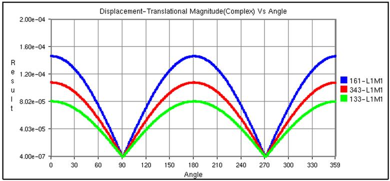
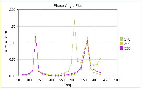
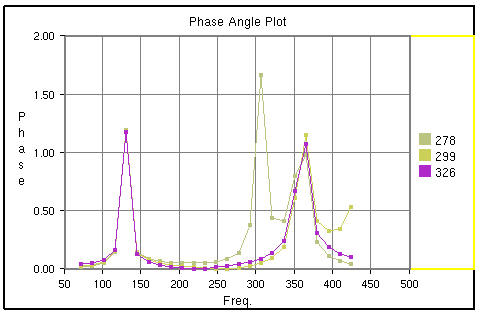
Harmonic Plot
X axis: Angle (0 to 360)
Y axis: Complex Derived Result
Input: Node ID sets, Instances.
This plot is applicable for only complex Eigen results. Harmonic plot option will display the variation of any complex result with respect to angle (= ωt). Using this plot, users can identify the angle for which a derived result is maximum.
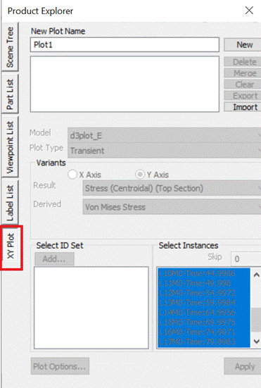
XYPlot Panel
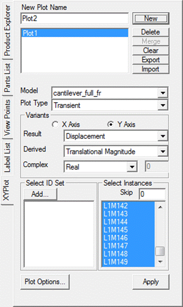
The various fields and options available in the XYPlot panel are explained below
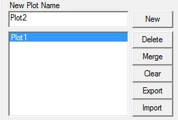
Plot Name |
Enter plot name. |
|---|---|
New |
Creates an empty XYPlot template. Created plot will be appended to the list box by its name. |
Delete |
Deletes user selected plots. |
Merge |
Merges selected plots into a new XYPlot. |
Clear |
Clears current graph data. |
Export |
Exports the graph table data into a comma separated excel file. (csv) |
Import |
Imports the comma separated excel file in a specific format. |
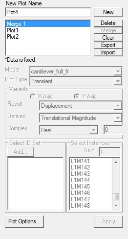
Model |
Allows users to select a CAE model. |
Plot Type |
Possible plot types of selected CAE models will be listed. Users can select one of them. |
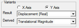
Variants |
Users should define the X and Y axis variants. |
Result |
Allows users to select a possible result for X/Y axis. |
Derived |
Allows users to select a derived scalar type. |
Complex |
Allows users to select complex components of results and enter angle in degrees. This option is enabled and applicable for complex eigen data results. |
Add |
Pops up a Node ID set dialog. It helps users to define Node ID sets. Defined Node ID set names are appended to the XYPlot panel as well in the popped up panel. |
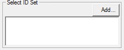
Select ID set |
Allows users to select multiple Node ID sets. |
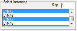
Select Instances |
Allows users to select multiple instance names. |
Skip |
Allows users to filter and select instances by skipping user specified number. It helps users in case of a huge instance list. |
Steps to create an XYPlot
Select XYPlot from the left span or click Edit | XYPlot.
Enter the XYPlot name in the text box.
Click New.
Make sure that an empty XYPlot is displayed in the viewer and plot name is appended in the list box.
Select a CAE Model and Plot Type from the drop down list.
4. Select the variants for X and Y axis. An X variant may be a CAE result or result attribute and Y variant should be of CAE result.
Select the proper derived scalar for both the axes.
Click Add to define the Node ID sets.
A Node ID Set dialog opens up
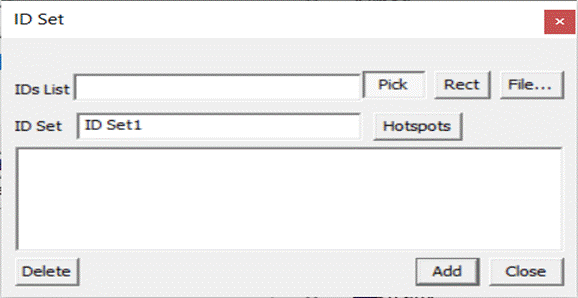
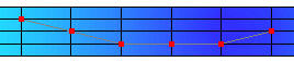
7. Users can provide Node ID numbers in three ways. One is to enter directly the known Node IDs in the text box separated by comma, the second by picking Node IDs in the viewer and third is by providing a file which contains Node IDs.
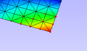
To pick the Node ID from the viewer, enable the Pick button.
9. Click Nodes in the viewer. Node ID points are highlighted with red color and are appended to the text box in the dialog for each click.

All points are connected by a line to show the sequence or path.
11. To select by window, click the Rect button which enables mouse mode to window selection.
Click and drag to define the window on the model.
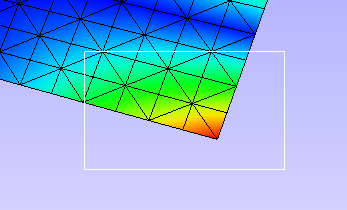
All node IDs within the window are highlighted as red spots.
Enter a Node ID set name.
15. Click Add to create the Node set or/and Close to close the window.
Created Node sets are listed in the XYPlot panel.
17. Select the Node ID sets required for your plot. Please note that Node ID set selection is not required for Min Max XYPlot.
18. Select the Instances required for the plot. If the instance list is too large for selection, users can filter using the Skip option
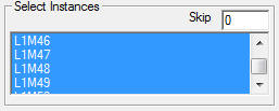
Skip option skips *n* number of instances between every consecutive selection. Where n is the number entered by the user in the Skip text. The event triggers only while changing the number in the text box.
19. Click Apply to construct the XYPlot with the above information and display in the viewer.
XYPlot Options Panel
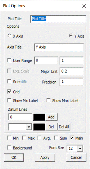
The various fields and options available in the Plot Options panel are explained below
Plot Title |
Displays plot title and allows users to edit it. |
|---|---|
Axes Title |
Displays axes titles and allows users to edit it. |
User Range |
Allows users to edit min and max value. |
Log. Scale |
Toggles between Logarithmic and Decimal Scale for the selected axis. |
Major Unit |
Major unit for axis tick mark. |
Scientific |
Toggles between Scientific and Decimal format. |
Precision |
Allows users to change the precision value in the format. |
Grid |
Shows /Hides axes grid. |
Show Min Label |
Displays the minimum result data point in a label. |
Show Max Label |
Displays the maximum result data point in a label. |
Max |
Show/Hides a curve with maximum of all y axis values against x axis invariant values. |
Min |
Show/Hides a curve with minimum of all y axis values against x axis invariant values. |
Average |
Show/Hides a curve with average of all y axis values against x axis invariant values. |
Sum |
Displays a curve with sums of all y axis values against x axis invariant values. |
Main |
Show/Hides the actual curves |
Background |
Sets background and allows users to change the color. |
Steps to modify the XYPlot style
Create a plot and construct with CAE data.
XYPlot can be modified with text formats.
Click Plot Options in the XYPlot panel. Or
Use “Ctrl + Double Click” to open the XYPlot options
dialog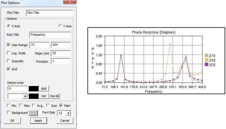
Change the plot titles.
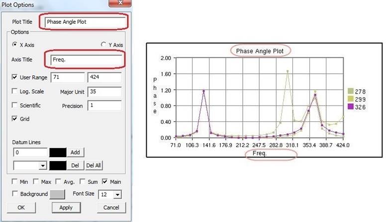
Change Y axis user range, major unit and precision values.
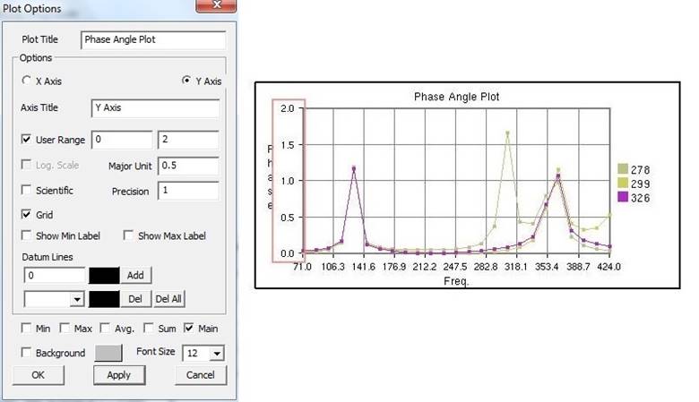
Change X Axis range, major unit and precision values.
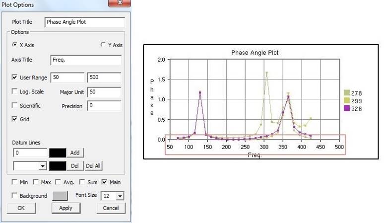
Grids for each axis can be switched on/off.
Click Sum, Max, Min and Average options and uncheck main.
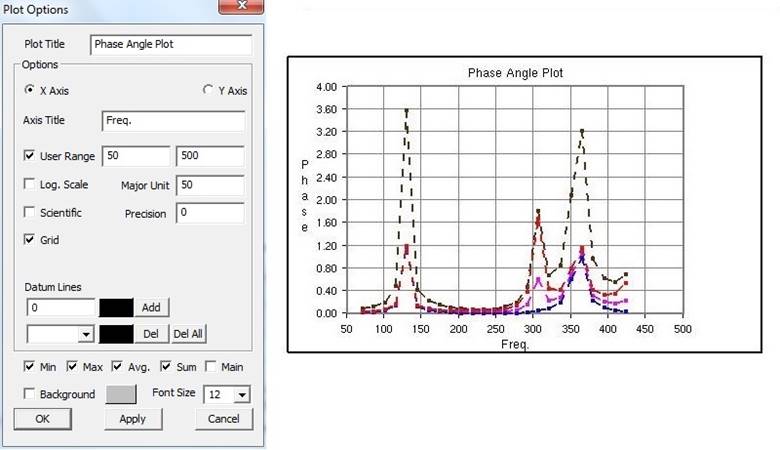
All these special curves are displayed in stippled lines.
Sum Curve is in dark brown, Max curve is in Red, Min Curve in blue and Average curve is in magenta.
If there is large variation between curves then log. scale can be used for corresponding axis.
Scientific format can be used if the tick mark text is too lengthy and overlaps with the next tick.
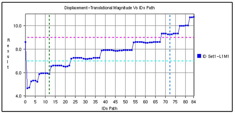
Steps to add datum lines
Select either X or Y axis.
Enter a value, which is within the range. Otherwise it is ignored.
Select a color corresponding to datum value from the color window.
Click Add.
Datum line and color will be added and rendered imimagestely. Further it also adds to the datum list combo box.
Repeat the steps to add more datum lines.
Select a datum line to be deleted by its value.
Click Del to delete it.
Click Del All to delete all datum lines for the axis.
Datum lines are drawn in stipple lines by default.
VCollab stores all datum lines into viewpoint and CAX. Below is a sample plot with datum lines for each axis.
Steps to select, move and resize the plot
Click a plot name in the plot list of XYPlot panel. Or
Double click the plot in the viewer
The XYPlot will be highlighted. and is ready for moving resizing.
Move the cursor over the plot until it changes to

Click inside the plot and drag the mouse to move the plot.
Move the mouse to the plot edges and notice that the cursor symbol is changing to

Click and drag the mouse with the resize symbol to resize the plot.
Users can select plot regions too by double clicking.
Selected region can be resized.
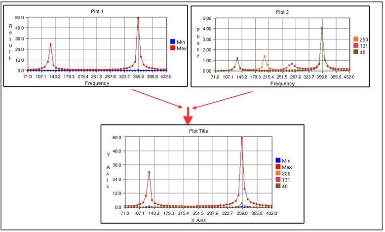
Steps to merge plots
Select XYPlots from the plot list panel.
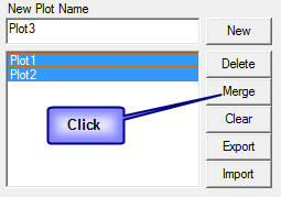
Click Merge.
A new Non-Editable plot is created and appended in the list. All dialog controls will be disabled for Non-Editable Plot.
The same plot is displayed and highlighted in the viewer.
Steps to export and import XYPlot data
Select XYPlots in the plot list panel.
Click Export.
Enter a filename in the save file dialog box that opens.
Plot name is suffixed to the file name to differ between other plots. Each plot is exported as one CSV file.
Click Import to load existing plot files.
VCollab supports CSV files and LSDyna binout data files.
IA file browser dialog opens up with .csv file types by default.
The CSV file should be in a particular format as explained at the end of this modules.
Select all the XYPlot CSV files and click open.
All plots are imported as Non-Editable plots as it does not contain CAE information.
Change the File type in the file browser dialog as binout to import LSDyna binout data.
XYPlot Data File Format
This is a comma separated value (CSV) file and can be viewed in an excel spreadsheet.
Format 1: VCOLLAB_XYPLOT_FILE_CSV_X_SINGLE
In this format, X axis values are the same for all curves. First column refers to X axis and other columns refers to curve Y axis values.
Line 1 |
File Type Header |
VCOLLAB_XYPLOT_FILE_CSV_X_SINGLE |
|---|---|---|
Line 2 |
Column Headers |
<X axis Invariant>,<Curve1 Name>,<Curve 2 Name>, …, |
Line 3 |
Value 1 |
<val>,<val>,<val>,…, |
Line 4 |
Value 2 |
<val>,<val>,<val>,…, |
Line … |
Value .. |
<val>,<val>,<val>,…, |
Line N |
Value N |
<val>,<val>,<val>,…, |
<EOF> |
VCOLLAB_XYPLOT_FILE_CSV_X_SINGLE Time,Node1, Node2, Node3, 0.0, 0.0, 0.5, 0.023, 0.1, 2.0, 0.35,1.023, 0.25,3.0,0.023,2.653, 0.302, 4.0,0.02,2.023, 0.43,13.0,0.5,1.023, 0.5,17.0,1.5, 2.023, |
|---|
Format 2: VCOLLAB_XYPLOT_FILE_CSV_X_SINGLE_ATTRIBUTE
In this format, one additional column is introduced to track the data points based on its attribute values. This is useful to compare two different curve positions for a given attribute. Attributes can be time, frequency, angle, etc.
Line 1 |
File Type Header |
VCOLLAB_XYPLOT_FILE_CSV_X_SINGLE_ATTRIBUTE |
|---|---|---|
Line 2 |
Column Headers |
<Attribute_Name>, <X axis Invariant>,<Curve1 Name>,<Curve 2 Name>, …, |
Line 3 |
Value 1 |
<attrib_val>,<val>,<val>,<val>,…, |
Line 4 |
Value 2 |
<attrib_val>,<val>,<val>,<val>,…, |
Line … |
Value .. |
<attrib_val>,<val>,<val>,<val>,…, |
Line N |
Value N |
<attrib_val>,<val>,<val>,<val>,…, |
<EOF> |
Example:
VCOLLAB_XYPLOT_FILE_CSV_X_SINGLE_ATTRIBUTE Time, Displacement, Velocity1, Velocity2, Velocity3, 0.0, 0.0, 0.5, 0.023,0.12, 0.1, 2.0, 0.35,1.023,2.56, 0.25,3.0,0.023,2.653,3.27, 0.302, 4.0,0.02,2.023,4.7, 0.43,13.0,0.5,1.023,9.34, 0.5,17.0,1.5, 2.023,11, |
|---|
Format 3: VCOLLAB_XYPLOT_FILE_CSV_X_MULTIPLE
This format contains multiple curves without any constant X axis invariant. As there is no common relation between curve data points, each curve is written one after the other in two columns.
Line 1 |
File Type Header |
VCOLLAB_XYPLOT_FILE_CSV_X_MULTIPLE |
|---|---|---|
Line 2 |
Column Headers |
<X Axis_Name>, <Y Axis Name> |
Line 3 |
Curve1 Name |
[Curve Name: curve1] |
Line 4 |
Value 1 |
<val>,<val>, |
Line 5 |
Value 2 |
<val>,<val>, |
Line … |
Value .. |
<val>,<val>, |
Line k |
Value k |
<val>,<val>, |
Line k+1 |
Empty Space |
|
Curve1 Name |
[Curve Name: curve 2] |
|
Value 1 |
<val>,<val>, |
|
Value 2 |
<val>,<val>, |
|
… |
Value .. |
<val>,<val>, |
Line N |
Value N |
<val>,<val>, |
<EOF> |
Example:
VCOLLAB_XYPLOT_FILE_CSV_X_MULTIPLE, Velocity,Displacement [Curve Name:Min], 0,0 5.97E-06,0 2.81E-05,0.000371262 0.00137967,0.00325967 0.00841877,0.0122644 0.0215457,0.0405959 [Curve Name:Max], 0,0 0.084583,0.189293 0.324686,0.787124 0.823688,3.34673 6.10108,9.28285 54.4091,126.704 154.139,283.757 84.6285,436.429 82.1926,410.865 67.4474,417.654 |
|---|
Format 4: VCOLLAB_XYPLOT_FILE_CSV_X_MULTIPLE_ATTRIBUTE
This format contains multiple curves without any constant X axis invariant. As there is no common relation between curve data points, each curve is written one after the other in two columns.
Line 1 |
File Type Header |
VCOLLAB_XYPLOT_FILE_CSV_X_MULTIPLE_ATTRIBUTE |
|---|---|---|
Line 2 |
Column Headers |
<Attribute Name>, <X Axis_Name>, <Y Axis Name> |
Line 3 |
Curve1 Name |
[Curve Name: curve1] |
Line 4 |
Value 1 |
<atrib_val>,<val>,<val>, |
Line 5 |
Value 2 |
<atrib_val>,<val>,<val>, |
Line … |
Value .. |
<atrib_val>,<val>,<val>, |
Line k |
Value k |
<atrib_val>,<val>,<val>, |
Line k+1 |
Empty Space |
|
Curve1 Name |
[Curve Name: curve 2] |
|
Value 1 |
<atrib_val>,<val>,<val>, |
|
Value 2 |
<atrib_val>,<val>,<val>, |
|
… |
Value .. |
<atrib_val>,<val>,<val>, |
Line N |
Value N |
<atrib_val>,<val>,<val>, |
<EOF> |
Example:
VCOLLAB_XYPLOT_FILE_CSV_X_MULTIPLE_ATTRIBUTE Time,Velocity,Result [Curve Name:N201] 0,0,0, 4.99443,5.97401e-06,0, 9.99323,2.80677e-05,0.000371262, 14.9916,0.00137967,0.00325967, 19.993,0.00841877,0.0122644, 24.9934,0.0215457,0.0405959, 29.9992,0.0280345,0.172643, 34.9985,0.043332,0.49279, [Curve Name:N234] 0,0,0, 9.99323,0.324686,0.787124, 19.993,6.10108,9.28285, 29.9992,154.139,283.757, 34.9985,84.6285,436.429, |
|---|
Steps to import history plot (*.json) files
Go to the XYPlot panel.
Click the Import button.
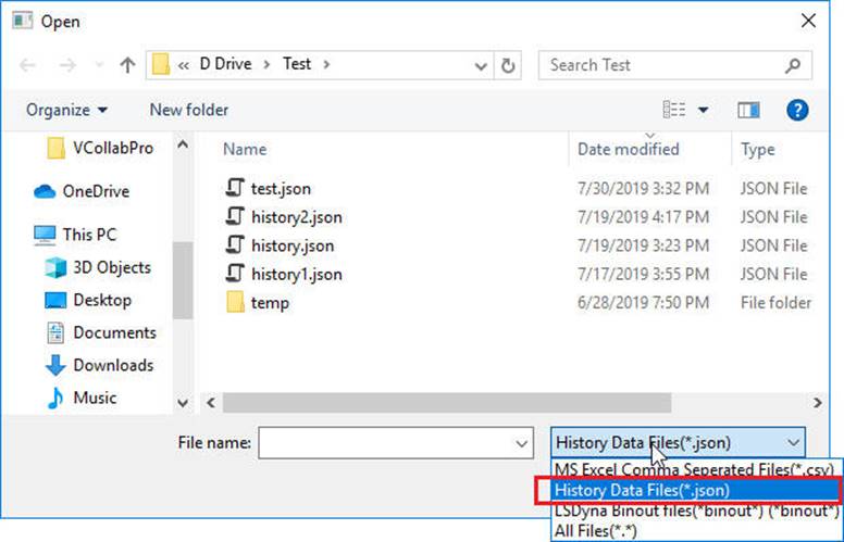
Change file list filter into History data files (*.json) in the file browser dialog box
Select the file and click Open.
The History Plot dialog opens up
Select a result from the dropdown list.
Select reference entities if available.
Select the scalar components if available
Click Append to append the history curve into the existing plot.
Click the Create button to create a new XYPlot and append the selected curves.